- Anmelden
- Registrieren
-
CH

- AE Vereinigte Arabische Emirate
- AT Österreich
- AU Australien
- BE Belgien
- CA Kanada
- CH Schweiz
- CZ Tschechische Republik
- DE Deutschland
- FI Finnland
- FR Frankreich
- GR Griechenland
- HU Ungarn
- IE Irland
- IN Indien
- IT Italien
- MY Malaysia
- NL Niederlande
- NZ Neuseeland
- PL Polen
- PT Portugal
- RU Russland
- SE Schweden
- TR Türkei
- UK Großbritannien
- US USA
- ZA Südafrika
- Andere Länder
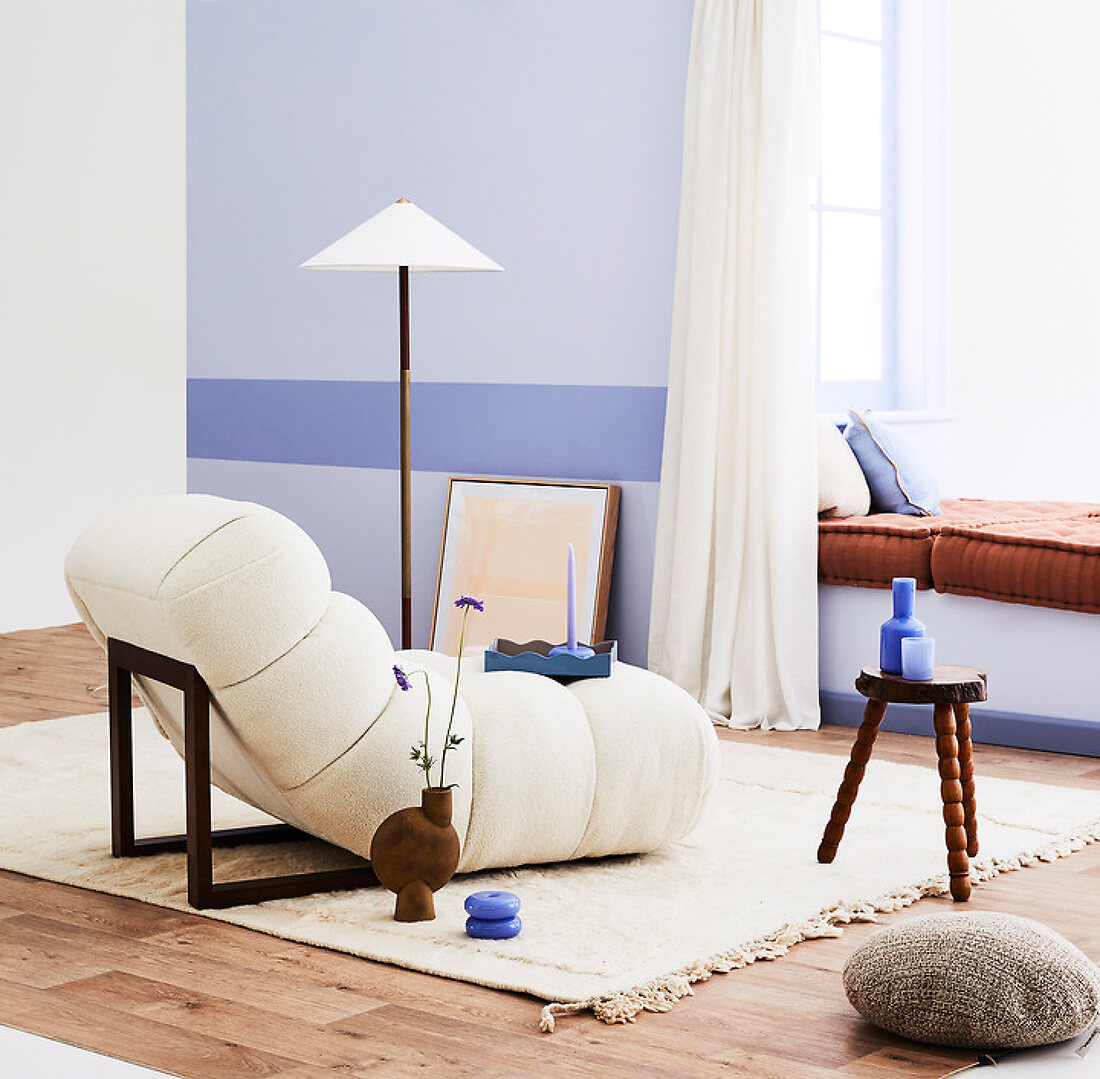
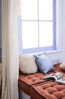
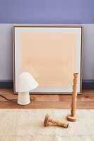
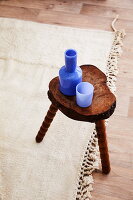
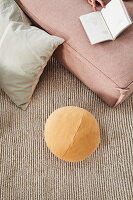
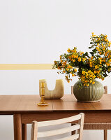
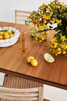
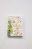
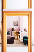
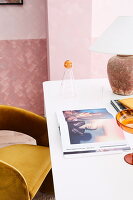
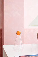
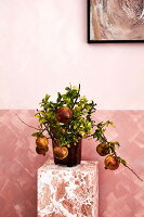
Der richtige Ton
Feature 13482617 | © living4media / Are Media / Are Media | 18 Bilder
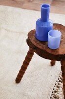
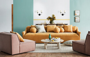
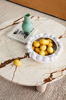
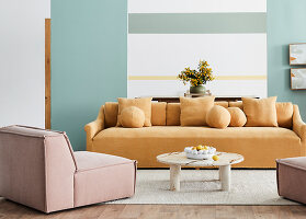
So schön eine neutrale Palette auch ist: Bunte Farbtupfer machen Räume erst lebendig!
Details
| Feature-Nr.: | 13482617 |
| Anzahl der Bilder: | 18 |
| Text: | Text written upon request (700-1000 words, English) |
| Fotograf: | © living4media / Are Media / Are Media |
| Genre: | Deko |
| Verfügbare Rechte: | Worldwide first rights available upon request, except in AU, NZ, ZA |
| Verfügbarkeit: |
|
| Modell-Rechte: | nicht erforderlich |
| Eigentums-Rechte: | Derzeit liegt noch kein Release vor. Bitte kontaktieren Sie uns vor Verwendung. |
| Preise: | Auf Anfrage. Gerne erstellen wir Ihnen ein individuelles Angebot. |
| Bestellung: | Für Feindaten und Texte kontaktieren Sie uns bitte. |
Alle Bilder des Features (18)


Keywords
Blau Blautöne Dekoration Designermöbel Farbakzent Farbe Farbenfroh Farbkonzept Farbton Grün Hell Idee Innen Innendeko Niemand Pastell Pastellton Rosafarben Rosatöne Wandfarbe Wandgestaltung Zeitgenössisch

